Report
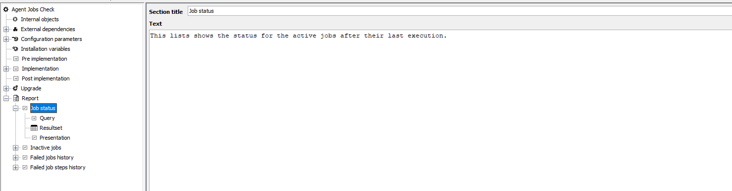
The report section of a job is a lightweight version of the reporting engine in Control Center. It supports SQL queries that can be used in multiple output formats, such as graphs and tables.
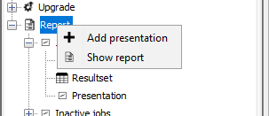
You can right-click on the “Report” item, add new sections to the presentation with the “Add presentation” button. Its also possible to run the report with the “Show report” button, which opens the report output in an other window.
The first section is where you can set the section title, and a text that will come above the graph or table presented. It is there to add context and provide the user information of what data is displayed in the graph or table below.
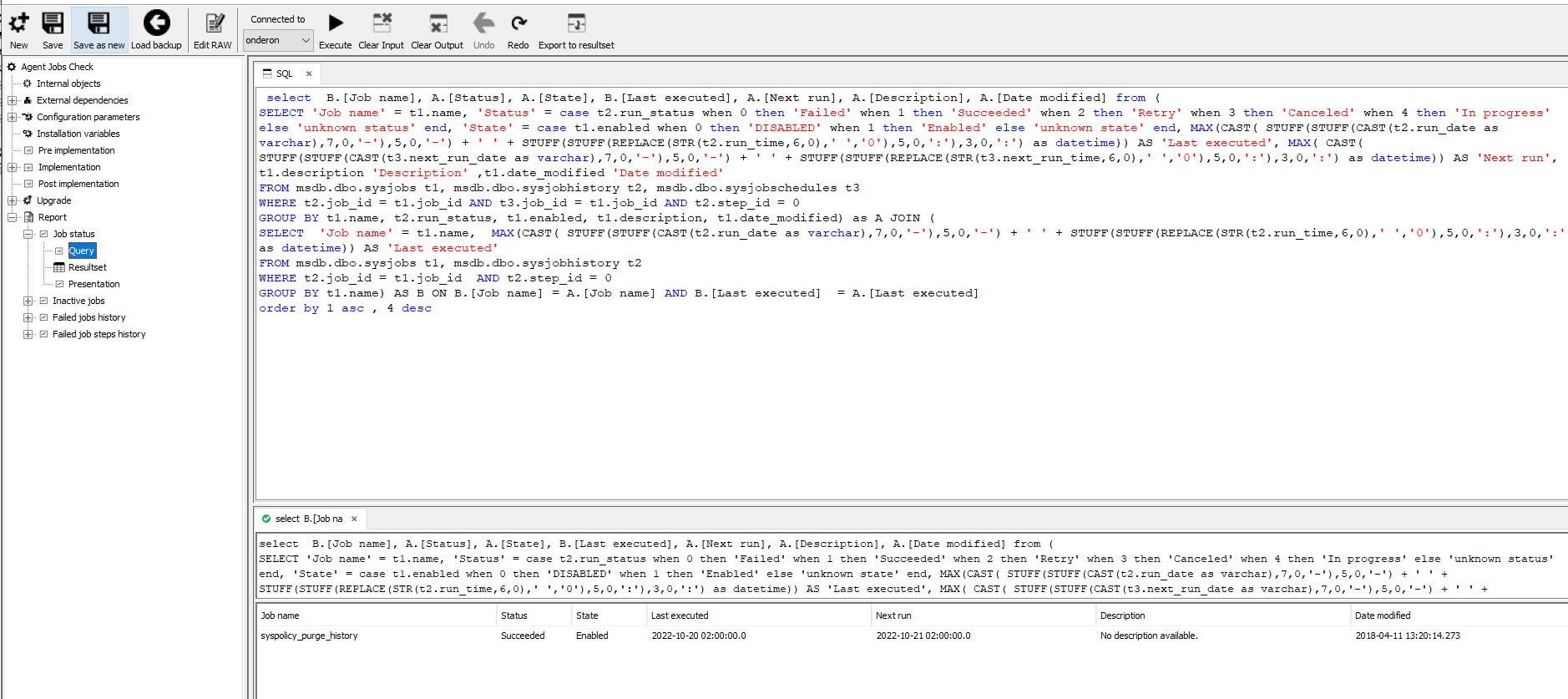
The “Query” section is where you can put in the SQL query that you will run. Typically the report is developed after the main procedure of the job and the underlying tables are created, (and installed on a database instance), and the report will query that data. This will also make the report development more streamlined, as you can then run the query (select instance with “Connected to”, and “Execute” to run), this will then display below, and you can see that you have the correct data to move forward. Additionally this gives the editor information about what datatypes to expect, aiding in the next step of the process. Once you have the correct data, click on “Export to resultset” (note that this will overwrite any changes you have made to the resultset section).
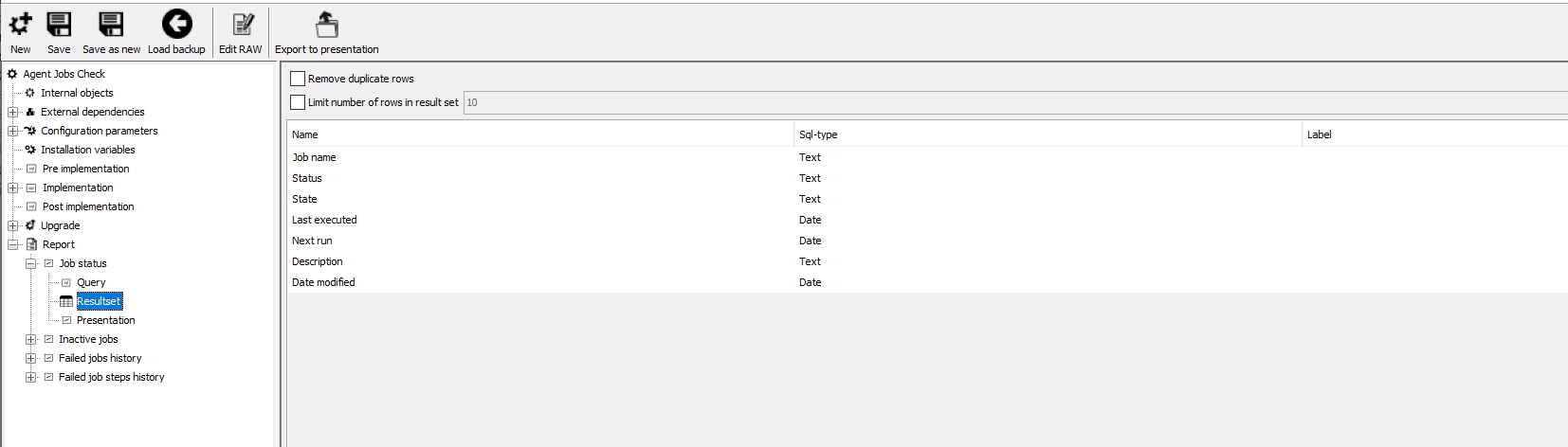
In the “Resultset” section, we can adjust datatypes (this will help format numbers if needed), add labels to the fields, remove duplicate rows and limit resultset rows. The resultset limit is done post-database-processing, so the full query will run on the database side.
Once happy, you can click on “Export to presentation”. This changes the presentation section, so don’t do this if you have done many changes to the presentation section. Its usually done the first time to get the right column name populated.
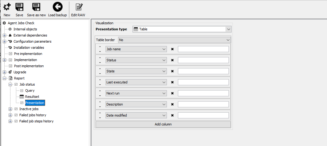
In the “Presentation” section you can present the data in different ways. The default is the table view. You can set if you want a border around the table, and order of, selection of, and label on, the column values from the result set.
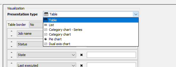
There are six presentation types:
“Table”, the default, to create a table with contents.
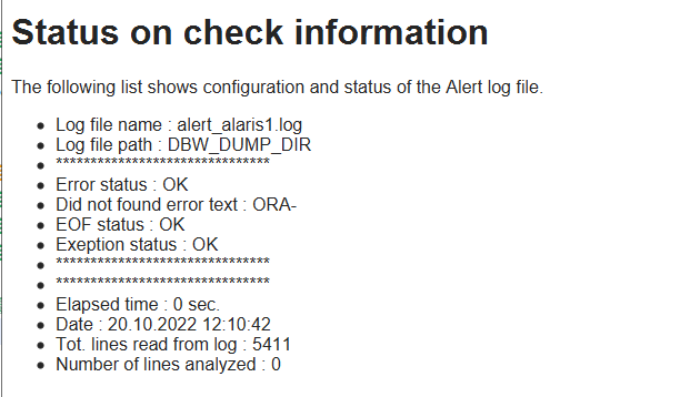
“List”, is best for text values, one column that should be displayed like a file. Such as output from a logfile etc.
“Category chart – Series”
“Category chart”
“Pie chart”
“Dual axis chart”
Table format
Definition
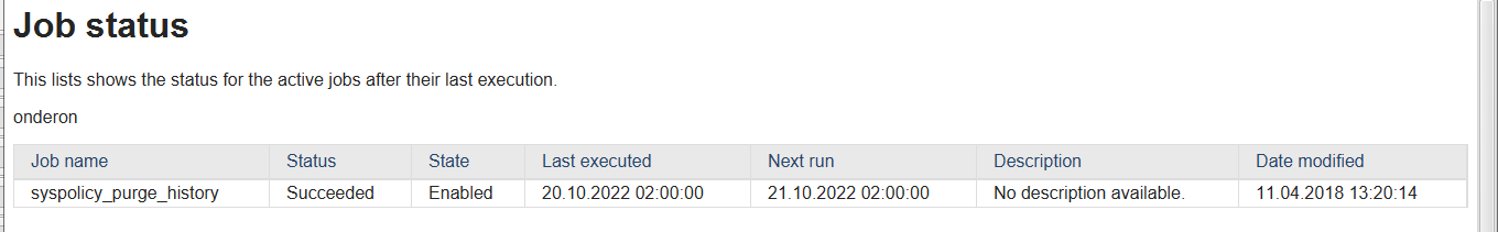
Result
List
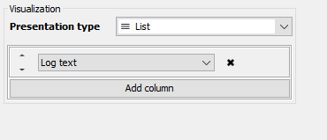 Definition
 Result
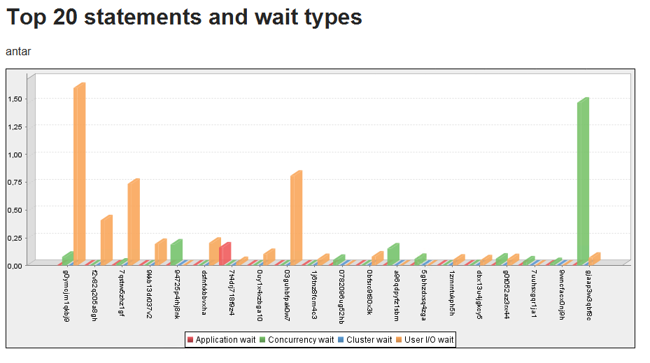
Category chart – series
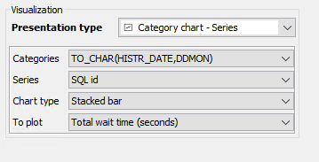
Definition
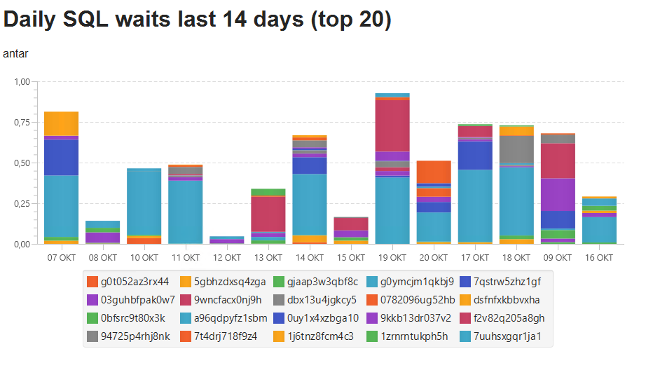
Result
Category chart
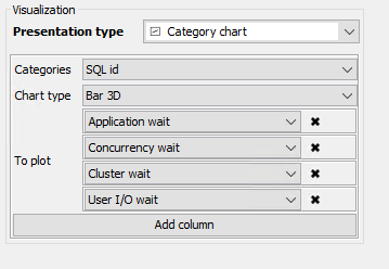
Definition
Result
Pie chart
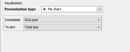
Definition
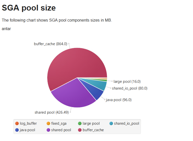
Result
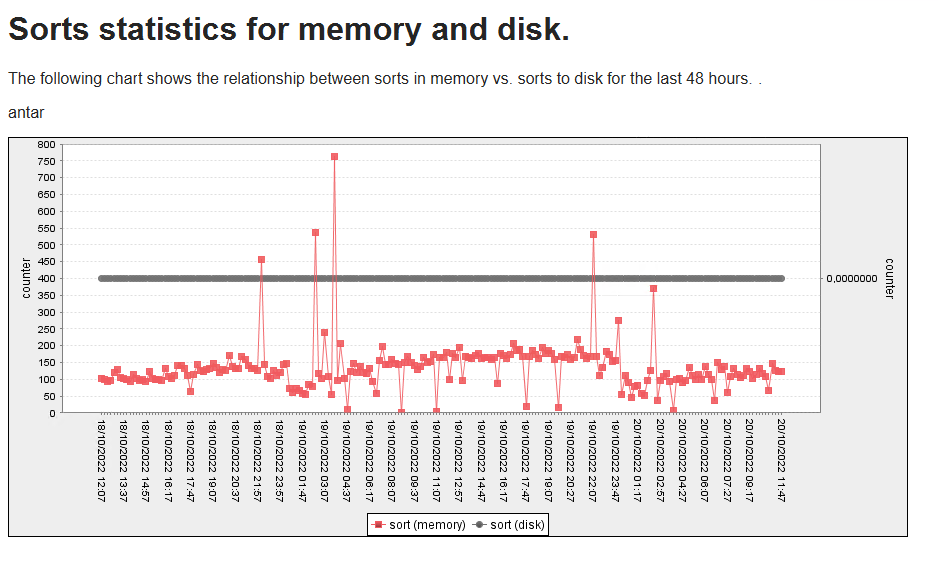
Dual axis chart
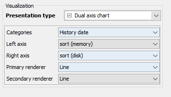
Definition
Result